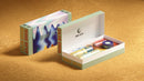
Although all of our mass production artwork runs through an offset printer, not all of the artwork is printed in the same way. When creating your artwork you will have to decide between spot or process colors. Not sure what either is? Here's some useful information.
Spot colors are premixed colors that produce accurate color matches to solid elements within the artwork. We utilize the Pantone Matching System (PMS) as a standard to produce spot colors, but we can also mix custom spot colors in order to match physical samples of other collateral. Pantone spot colors appear differently on different substrates, like coated and uncoated papers. They’re also available in metallic and pastel options.

Process color printing is the active layering of colors to create artwork. Typically Cyan, Magenta, Yellow, and Black (CMYK) inks are stacked in dotted patterns at different angles to create a broad range of colors and images. Process color printing is a very versatile form of printing and much of the artwork on our tubes is printed using process color printing.

You should use spot colors in situations where you need a specific color match to corporate branding standards, or your artwork includes large solid areas of a single color. This ensures even and accurate color coverage. In order to use spot colors, make sure that your artwork is set up as vector objects, and there are no overlays, transparencies, or gradients.

You should use process colors when your artwork includes photographic images, there are a lot of overlays and transparencies, and precise color matching is not essential.
Prototypes are usually printed on a digital printing press using CMYK process colors. If your artwork contains spot Pantone colors, they will be converted to CMYK equivalents. Our prototypes are intended to proof tube size, product fit, and artwork layout. They are not meant for color proofing, especially if your artwork is set up using spot colors. In a situation where color matching is crucial at the prototyping stage, we may recommend making offset-printed samples.
 photo of a digitally printed prototype
After the prototypes have been approved, we proceed into mass production. Here, all printing is done using offset (litho) equipment. These room-sizes machines are longer and more expensive to set up than digital presses, but allow for better print quality and higher output. Unlike digital printers that feed and mix CMYK inks into a moving nozzle, offset presses have separate “stations” for each color that require printing screens trough which inks transfer onto the substrate.
Example of a four color offset printerSame Pantone colors may appear differently on different substrates. Check the Pantone website for Coated, Uncoated, and Metallic color guides.
There is an acceptable tolerance for color matching. We strive to be as precise as possible, but substrate, finish, and lighting conditions may have an impact on color perception. For example, soft touch lamination impacts final color perception, even if Pantone colors are accurately printed on the paper before it's laminated.
Whenever you’re creating artwork that utilizes Pantone spot colors, create call-out icons and swatches for easy identification.
While we can print opacities, it’s hard to predict what the resulting color/shade will look like. If at all possible, set up your artwork to print at 100% opacity.
You can convert Pantone spot colors to CMYK process colors by clicking on the color in your swatches panel and switching it to process color instead of spot.
CMYK colors printed on digital presses during prototyping may appear different from the same CMYK colors printed on offset presses during mass production. To ensure color accuracy, it's always best to provide us with a physical sample of what you're trying to match (product labels, POP displays). We'll do our best to match your color targets, however there may be some differences based on variability in substrate and printing process.